Special Note: This post was composed a week prior to the decision to overhaul the theme for this website. Thus, the font reference below, "Domine," is now anachronistic and passé. The font family here, now, is Lora. Apologies for any confusion.
In the category of “Will the Internet Always Be a Wild West Show?” I want to discuss font choices online. There used to be fairly clear rules for when you use sans serif fonts and when serif ones were more appropriate. In the old days when you finally got that Mac and were confronted with this massive fruit basket of typefaces your instinct was to go hog wild. I have always loved Comic Sans and once used it to print out a draft of a short story I’d written, only to find myself dizzy and feeling quite puckish reading half way through the second page.
I’d owned my Mac II and laser printer for about two years when I first read The Mac is Not a Typewriter. That was back around 1990. Already, folks were out of control with font choices for desktop publishing projects. That was a good decade before the Internet got rolling with its infinite number of “pages” and sites.
To me, infinity and creativity have always gone together. I remember sitting in advanced algebra class in my sophomore year of high school, dumbfounded to learn from Miss Mills that infinity squared is equal to infinity plus one.
What an amazing, random, and unforgiving world, I thought.
This mathematical puzzle (we were studying imaginary numbers) seemed so incredible to me I actually fell into a revery questioning the very purpose of Infinity, wondering if it was either: 1) Imaginary; or 2) Truly impossible to conceive of.
Somehow I managed to conclude that teenage moment with the idea that the only place outside of mathematical reality (so rarified) where infinity had any practical value was in the realm of the artistic imagination. You can go off in so many directions when you realize the power of that idea (think perpetual motion and total denial of the laws of physics) .
Every now and then I wonder how many alpha-numeric characters there are floating around the virtual world if there are already an infinite number of pages and websites.
The way I get back to reality from that admittedly weird way of thinking is by considering the problem of fonts and how font choice can tell you a lot about owners of Internet acreage. For instance, I’ve written for a number of online publications over the past two decades. It always surprises me when I find a 2000-word profile or essay posted in non-serif (i.e. sans serif) typeface. What’s weird is when one version of my work is published in a magazine using an appropriate text font but that the online archive is, for instance, 10-point Helvetica with 1.2 spacing between lines. You have to wonder if editors and publishers even check the electronic versions of the work they spilled blood, sweat, and tears over for glossy paper and assistance from the US Postal Service.
Take a look at this book excerpt of a new work by Catherine Lacey from the publisher MacMillan:
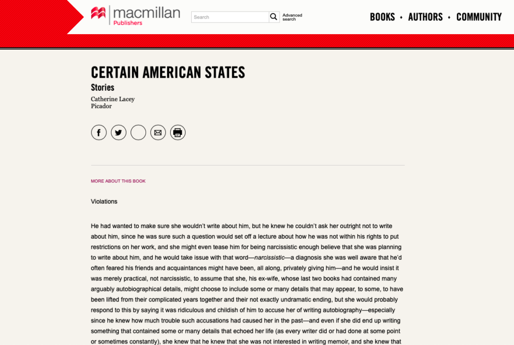
If you go to the web page itself, you should be able to understand why it’s so hard to read sans serif body text.
I don’t like being critical of other people’s creations, but it is surprising to me that such a venerable company, MacMillan Publishers, would be happy with this design. More importantly, and hopefully this is obvious, I can’t believe the author, Catherine Lacey, would be happy with this presentation at all. (As an aside, I want to point out that in the third line of the story as posted currently there is a typo. The Mac is not a typewriter for a very important reason! You can fix your screw ups until you have perfection).
I write this on a Saturday morning listening to our radio station WXPN broadcast huge chunks of the Woodstock concert from 50 years ago. Made me think of how freedom requires imperfection and contrast. Font-choice is such a great activity for exercising imperfection, contrast, and freedom. However, it’s also a great way to ensure that viewers and readers and users have major difficulties actually completing a post that someone has gone to the trouble of plopping into the Intersphere.
What I’m suggesting here, simply, is that folks consider screen font choices carefully. You don’t want something that “looks cool” or stands out. You want something that makes it easy for folks to read what you’ve posted. You also want something that tells visitors that you’ve thought some about what you’re doing and that you have their best interest in your heart of hearts. For all I know, MacMillan and Catherine Lacey are fine with their site. Personally, I’m going to copy the entire story they posted and paste it into Word here on my computer, then convert it to my favorite serif font, Marion, which is what I print all the drafts of my own work in before I create final products in Times New Roman.
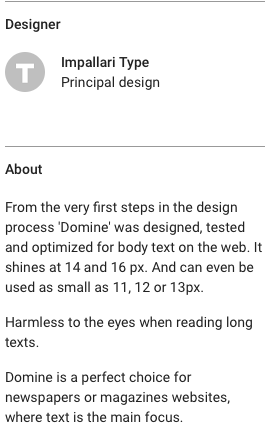
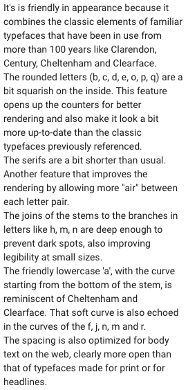
This here website of mine uses a font called Domine. I’ve posted some notes I found on Domine in the margins here. Regardless, this quick essay is not going to change much out there. That’s good in a bigger, more infinite sense. But remember, you can also always make things better on the Internet. What an amazing world we almost live in!
Indeed, the Mac is not a typewriter, it’s a power tool for rebels and clowns and smart freedom lovers everywhere on the Internet.